Info Overload- The New Design
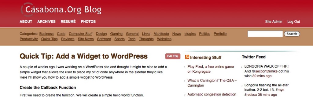
I hadn’t realized it, but next month will be 2 and a half years since my last redesign, which is considerably longer than my previous time between designs; I was young and impressionable and didn’t know what I wanted. But now something is different. My needs in 2007 were different than my needs now. Then, this was just a place for blog entries (and the occasional trying out a new web dev trick). Now information sharing has increased 10 fold. I have shared thoughts and links on Facebook, Google Reader, Twitter, and here. The new design needs to reflect that, especially since my day-to-day blogging has decreased with the advent of Twitter. I present to you: Info Overload. If you’re in a feed reader, click on through.
When I first started the redesign, I didn’t take the time to realize what I wanted out of it. The design, as a result, was disastrous. So I defined some goals:
- Showcase posts, links, and tweets all in the same place.
- Better page/theme management- the old design wasn’t dynamic AT ALL.
- Better Archive organization. If you’re familiar with my old design, you’ll know the archives were just thrown together haphazardly.
- Better Photo Management
- I didn’t want to spend a whole lot of time on design
The first point I already had planned: a three column layout, one for each section (similar to Mike Industries, but not done as well). Points 3 and 4 were taken care of through plugins, and 2 and 5 were taken care of by Crowd Favorite‘s (Alex King) Carrington Theme Framework.
Carrington is really a nice piece of software that really abstracts away a lot of theme development. For one, it gets rid of a lot of conditional coding needed to do special things with certain categories or tags, etc. Their default skin for the theme is also really close to what I had in mind, so I could use that as a starting point, significantly reducing my development time. If I did want to start from scratch, however, there is Carrington JAM (just add markup), which provides the skeleton for Carrington, and you can style it however you’d like. What’s really nice is how easy it is to add custom sidebars (or sections, for that matter) without having to fuss with the theme’s code too much. You’ll see that in full effect on my resume page. You can read all about Carrington here.
The reason I wanted to cut down on design time was partially due to lack of time and a want to redesign the blog quickly. The content was more important to me than coming up with a completely innovative design from scratch- Carrington was pefrect because I got to spend more time on organizing the content the way I wanted. Speaking of….
Three major plugins are at work here: Compact Archives, Flickr Gallery, and Twitter Tools. You’ll see Twitter Tools (also by Alex King) in the sidebar, far right column. It enables me to display my last x number of tweets, as well as a whole slew of other things. Compact Archives can be seen on the archives page, and showcases the archives by year – month is a very nice way (hat tip to Steve Mekosh for telling me about that plugin). The last one is Flickr Gallery, which is really fantastic and exactly what I was looking for. It adds all of my Flickr photos to my site, in gallery format, paged, and integrated with lightbox. Now I don’t need to double post photos or redirect people to flickr so they can view them. All my photos are right here.
Some final notes; For the middle (short right?) sidebar, I used WordPress’s built in RSS widget to pull in my Google Reader feed. I did have to add a bit of code to make it refresh more often than every 12 hours. I’ll share that in the next quick tip. I also added a bit of code to figure out the year the post was written in, adding a disclaimer on anything pre-2006 (my teen angst years). Finally, and you may have already noticed this, I switch domains from thejoey.net to casabonaorg-staging.eowgdit8-liquidwebsites.com/. Again, thejoey.net and “Revenge of the Nerd” were from my teen angst years and as I get older, I realize while they were fun (and funny to some), it’s time to let them go. So update your bookmarks! thejoey.net will work for a while (it’s up in October, but I will probably renew it for one more year). After that it will be gone.
That’s about it! If you notice any bugs, let me know (joe@casabonaorg-staging.eowgdit8-liquidwebsites.com).
LOVE the new design! It looks great. Thanks for the shout out!