
Creating a Responsive Gutenberg Price Table
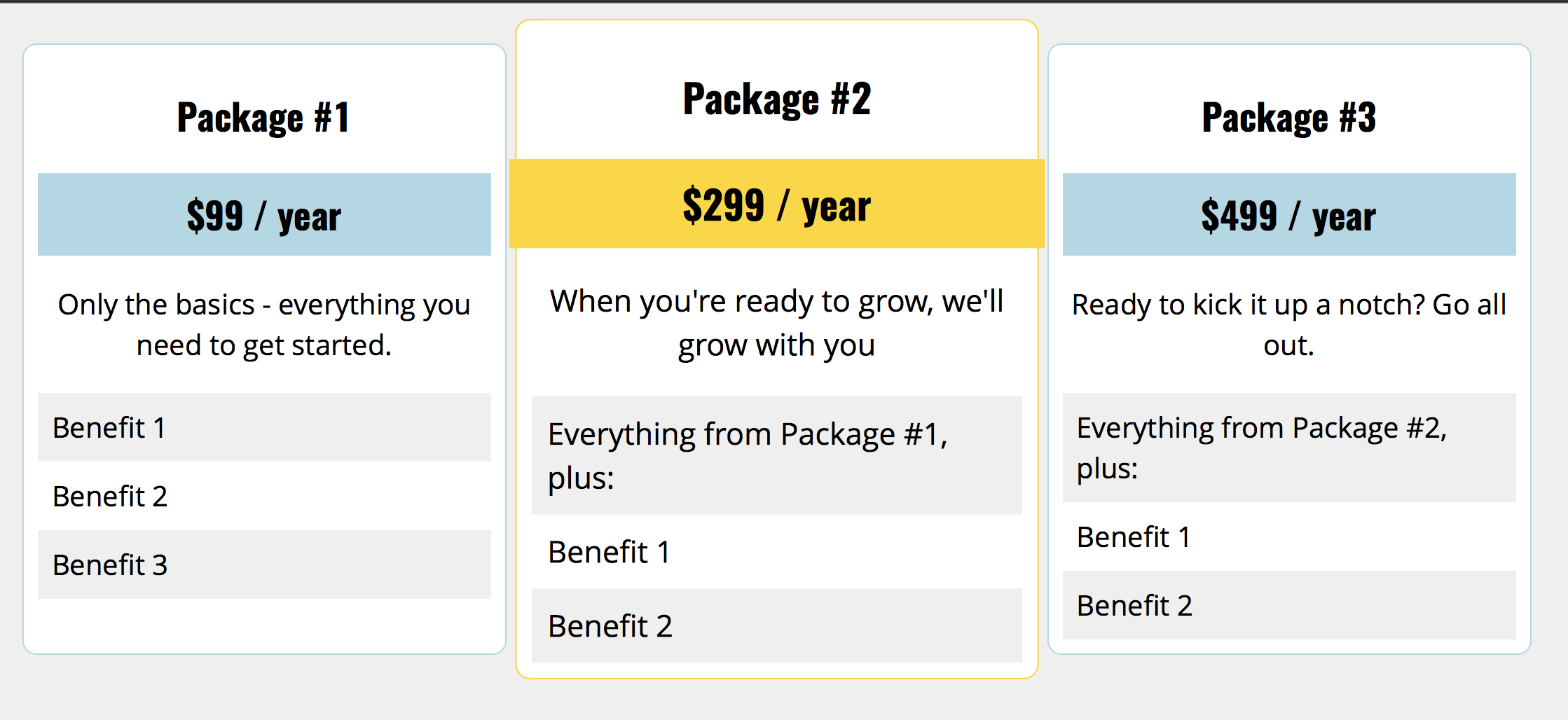
Last week I worked on an upcoming tutorial for a popular online publication on how to style the Gutenberg Columns block (I’ll be sure to send that along when it comes out). As as result, I decided to experiment to see what you could reasonable do, and came up with this Gutenberg Price Table: https://codepen.io/jcasabona/pen/RYvEYd. In this tutorial, we’ll go over some of the things we need to do to make this happen.
Requirements
There are few requirements / constraints:
- Only use Gutenberg markup – no additional HTML or Javascript
- It has to be responsive
- The stacking order for the columns needs to reflect content priority (e.g., the most important package should be the top one)
While I won’t do a full blown tutorial on how I did this (you can look for the upcoming tutorial for that), I will highlight some important parts aspects.
How Gutenberg Columns Work
There are three things to know about Gutenberg Columns:
- At the time of this writing, they use Flexbox. Originally they used CSS Grid, but the core team decided to switch to Flexbox for the better browser support
- There are 2 classes by default: wp-block-columns for the overall columns container and wp-block-column for the individual columns
- There’s a second class applied to wp-block-columns to let us know how many columns are in use: has-X-columns, where X is a number, In this case, the class is has-3-columns
You should also know that the minimal amount of CSS is added by Core: only enough to define the flexbox and make each column equal length.
Styling the Gutenberg Price Table
That means it’s up to use to pretty much fully style the columns. In the case of our Gutenberg price table, for full-width/large screens, we needed to:
- Add padding and margins
- add background colors, borders, and border radius
- Apply a CSS transform on the middle column to make it stand out a bit more
- Basic text styles and formatting
As we moved down to smaller screens, there are a few flex-related things we need to do. At the next level down we:
- Change the columns to wrap instead of filling in 1 full row. That means that when we run out of container room, the next column moves down.
- To highlight the middle column, we also tell the browser to make this 100% wide using flex-basis.
- And to make sure the 2nd column shows up on top, we change the order of the columns. The middle column gets an order of 1. The others get an order of 2.
This is where the most significant changes take place, as on the smallest screens, we just set all the columns to be full width and remove the transform off the Package #2 column. We still have to maintain the Flexbox to keep our custom order.
Wrapping Up
That’s it! Check out the CodePen for all of the code: https://codepen.io/jcasabona/pen/RYvEYd (it’s also embedded below). Like I said, I go more in-depth in my upcoming tutorial. If you want to learn more about Flexbox today, you can check out this CSS Tricks Guide.
Here we took a look at what Gutenberg Columns can do for us, and how we can make the most of them. And don’t forget – Gutenberg allows us to add custom classes too, so we could always add another class to our CSS and have a reusable block for a Gutenberg price table.
If you have any questions, you can respond to this email. And if you want to go in-depth with preparing your theme for Gutenberg, check out my Gutenberg Theming course.
[codepen_embed height=”265″ theme_id=”dark” slug_hash=”RYvEYd” default_tab=”css,result” user=”jcasabona”]See the Pen <a href=’https://codepen.io/jcasabona/pen/RYvEYd/’>Gutenberg Price Table</a> by Joe Casabona (<a href=’https://codepen.io/jcasabona’>@jcasabona</a>) on <a href=’https://codepen.io’>CodePen</a>.[/codepen_embed]